The critique where your screen goes on the wall
Critique, Thursday, half an hour
Designer Goal on the first slide: get people to a saved filter without opening settings. Two versions.
Second designer Before anything else — the visual hierarchy. Everything on the left version is the same weight, so my eye starts at the top left and gives up.
Designer The row is tappable end to end, that is the point.
Second designer The affordance is there and nothing says so. Put a chevron on it, or a shadow. Right now the only signifier is the one you know about because you drew it.
Engineer On the right version there are three new ideas on one screen. That is a lot of cognitive load for a first run.
Designer Then advanced goes behind progressive disclosure and the first screen keeps two things.
Writer The microcopy on the primary button says "Save and continue" and the screen only saves. Somebody will file that as a bug.
Second designer Also: why is this a modal. It blocks the list you are filtering, so people close it to check what they are filtering, and lose the form.
Designer Bottom sheet, then. The list stays behind it.
Engineer Touch target on the clear icon is twenty-four points. Grow the hit area, keep the icon.
Writer And the empty state currently says "Nothing here". First thing a new account sees, and it says nothing.
Second designer Last one, and I will say the word: the pre-ticked box at the bottom is a dark pattern. Untick it or drop it.
Designer Untick it. Bottom sheet, chevron, two lines in the empty state, back Thursday.
Half an hour, four people, one screen. Every sentence in the room is about something with a name, and the names are what makes the difference between feedback and taste.
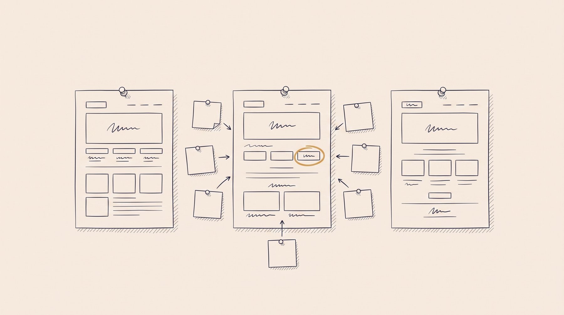
A critique moves from what the eye does to what the screen asks of a person
It opens with looking — weight, size, what is even visible as a control. Then it moves to load: how much a person is asked to hold at once, and what can wait. It ends where an interface stops being awkward and starts being unfair.
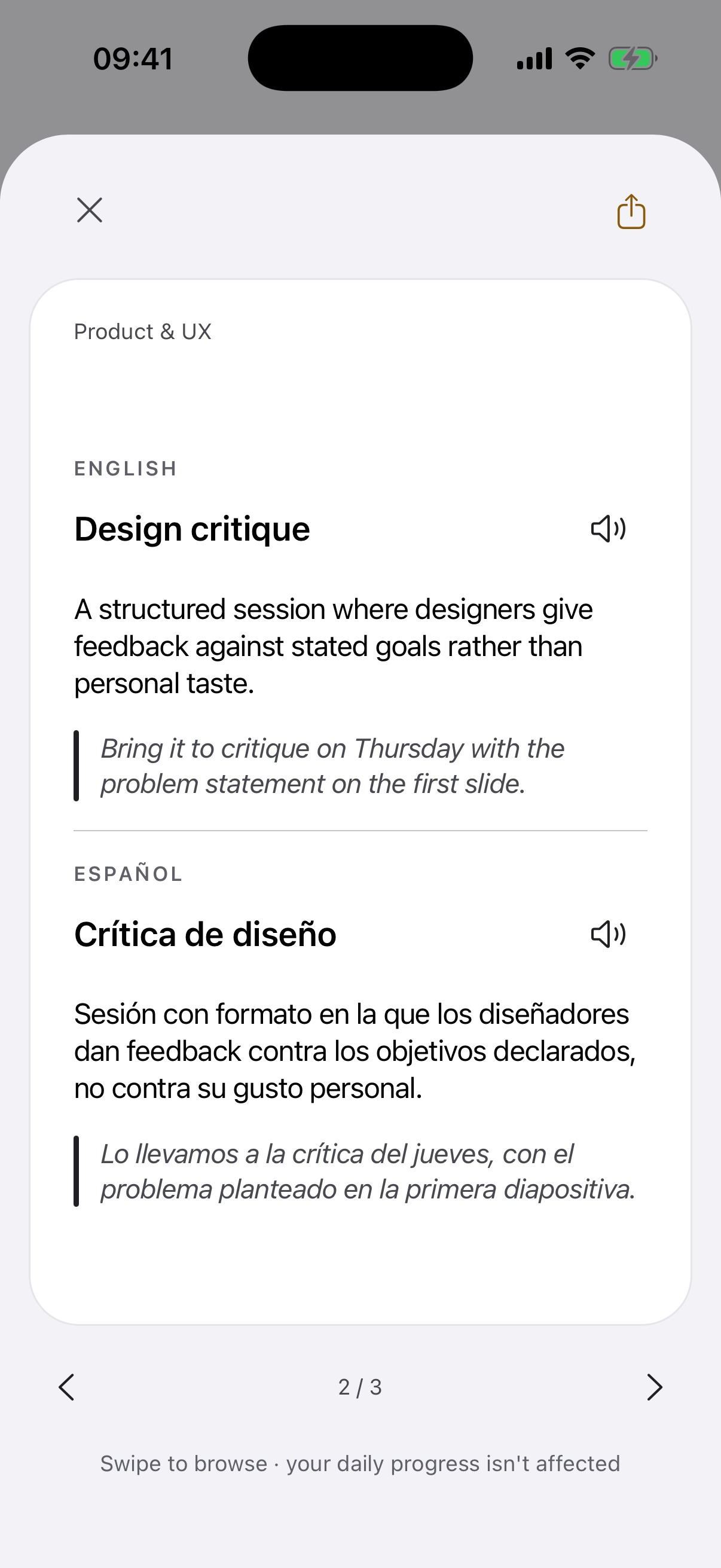
Design critiqueCrítica de diseño
A structured session where designers give feedback against stated goals rather than personal taste.
Bring it to critique on Thursday with the problem statement on the first slide.
The meeting itself, and the reason it is a discipline rather than a round of opinions. When the goal is missing from the first slide, taste fills the gap.
Visual hierarchyJerarquía visual
The arrangement of size, weight and space that tells the eye what to read first.
The visual hierarchy is flat, everything shouts at the same volume.
The first thing anyone reacts to, usually without naming it. "Busy" and "cluttered" are both this, said by someone who has no word for it.
Affordance
A property of an object that makes an action possible — in interfaces, what a control lets a person do.
The whole row has a tap affordance, not just the chevron at the end.
What a thing actually lets a person do — whether or not they can tell. Half the arguments in the room come from confusing it with the cue for it.
SignifierSignificante
A visible cue — a shadow, an arrow, a label — that tells a person where and how an action can be taken.
Add a signifier: a chevron, a shadow, anything that says it moves.
The other half of that argument, and the half designers forget to draw. A control can be perfectly tappable and completely invisible.
Cognitive loadCarga cognitiva
The amount of thinking a task demands at once, which an interface either adds to or absorbs.
Three new terms on one screen is too much cognitive load.
The reason a screen that is technically complete still gets sent back. Nobody measures it in the room, and everybody feels it.
Progressive disclosureRevelación progresiva
Showing only what is needed now and revealing advanced options as a person asks for them.
Hide the advanced settings behind progressive disclosure instead of one long form.
The usual answer when the screen is right and there is too much of it at once. Confused with hiding things: one waits to be asked, the other hopes to be missed.
Modal
A window that blocks the rest of the interface until it is dealt with.
Three modals in a row on first launch, no wonder people quit.
Chosen far more often than it is argued for. It costs a person the context they came in with, which is why it keeps getting swapped out.
Bottom sheet
A panel that slides up from the bottom of a mobile screen, over the content rather than replacing it.
Put the filters in a bottom sheet so the list stays visible.
The swap in question on phones, and the reason this one is a habit rather than a decision.
Empty stateEstado vacío
What a screen shows when there is no data yet, which is often a user's first real impression.
The empty state just says 'No items', and that's a wasted first screen.
The screen most people meet first and most teams write last. It is a whole conversation with a new account, and it usually says one word.
Microcopy
The small pieces of interface text — button labels, hints, error messages — that guide action.
The microcopy on that button promises something the screen doesn't do.
The smallest text in the product and the one that promises the most. When it and the screen disagree, support finds out before the team does.
Touch targetÁrea táctil
The tappable area of a control, which has to be large enough to hit reliably.
The touch target is 24 points, make the hit area bigger without changing the icon.
Where a design argument turns into a measurement, and the icon can stay as it is.
Dark patternPatrón oscuro
An interface designed to trick people into choices they did not intend, such as hidden costs or a buried cancel button.
Making unsubscribe grey and tiny is a dark pattern, and legal will say so too.
The line the room is looking for when it goes quiet. Rarely drawn on purpose; usually the result of one metric asked for too firmly.
The screen comes back next Thursday
With a chevron, a sheet instead of a window, and two lines where there was one. The words will be the same. The one presenting will be you.
Questions and answers
What about the rest of the product words?
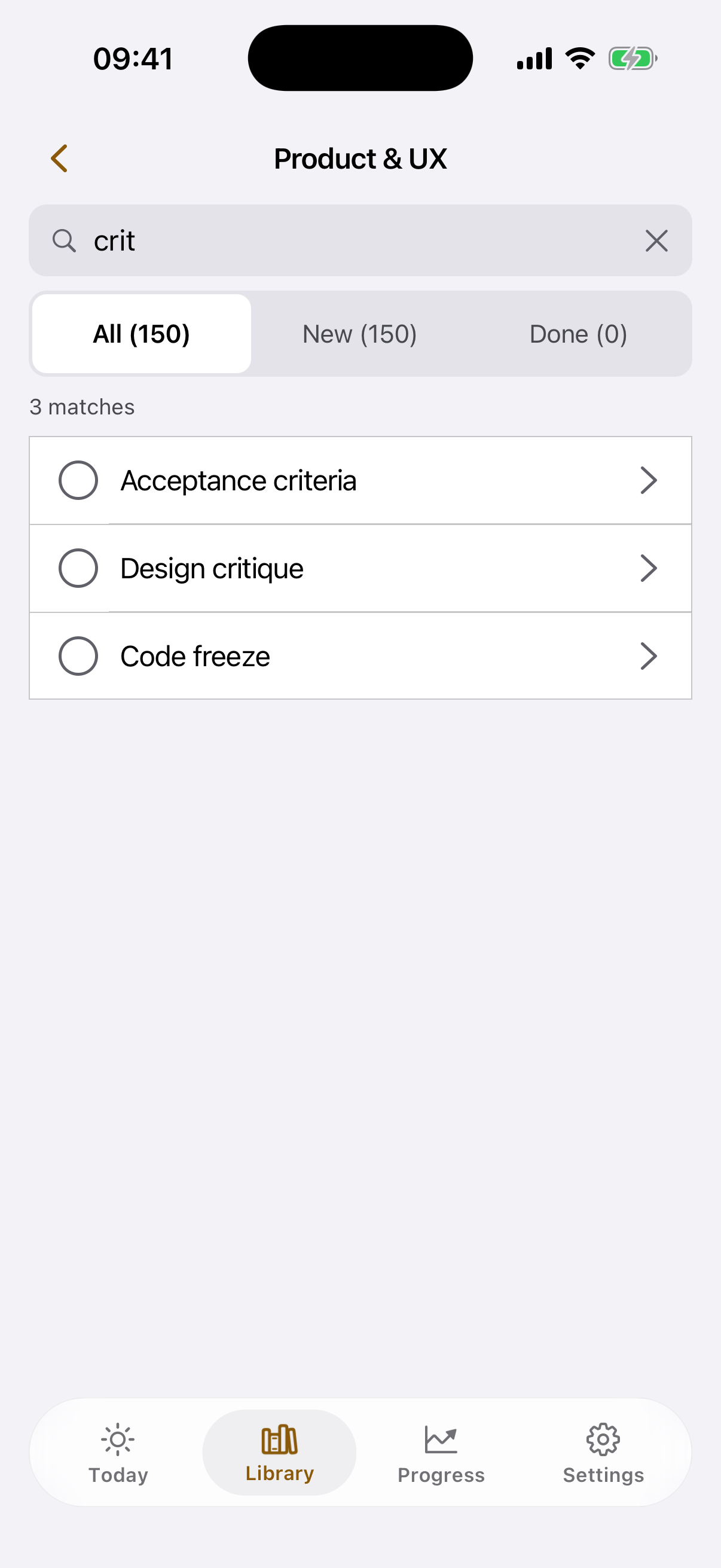
On the deck page, all 150. These twelve are the ones a single critique uses.
Why is there Spanish on the card?
The vocabulary of interfaces travels in English and gets discussed in Spanish, and "affordance" has no comfortable translation anywhere. Both forms sit on one card.
Where do the definitions come from?
From the Product & UX deck — the same cards as in the app.
The next critique will run on a different twelve.
The Product & UX deck holds the rest — in the app they come a few a day.