Product & UX
150 terms · English and Spanish
This is how people talk where a product gets decided: in the critique, in the debrief after a research session, in the call an hour before a release.
Researchers, designers, engineers and finance all use these words at the same table, and they do not always mean the same thing by them.
Jobs to be done (JTBD)Usability testingUnmoderated testingThink-aloud protocolContextual inquiryDiary studyScreenerLeading questionAffinity mappingEmpathy mapPersonaService blueprintCustomer journey mapUser flowMental modelVoice of the customer (VoC)NPS (Net Promoter Score)CSAT (Customer Satisfaction Score)CES (Customer Effort Score)SUS (System Usability Scale)Card sortingTree testingHeuristic evaluationCognitive walkthroughWizard of Oz prototypeFive-second testAssumption mappingRiskiest assumption test (RAT)PRD (Product Requirements Document)Non-goalAcceptance criteriaUser storyEpicDefinition of doneBacklog refinementStory pointVelocitySprintSprint goalScope creepRICEKano modelMoSCoWOpportunity solution treeRoadmapNorth star metricOKRRACIDecision logProduct trioFeature paritySunsettingAffordanceSignifierFitts's lawHick's lawJakob's lawGestalt principlesProgressive disclosureCognitive loadFrictionNudgeDark patternEmpty stateError stateSkeleton screenOptimistic UIMicro-interactionBottom sheetToastModalVisual hierarchyNegative spaceType scaleDesign systemDesign tokenAtomic designDesign critiqueDesign handoffDesign QADesign debtBreakpointMobile-firstAbove the foldProgressive enhancementHappy pathEdge caseOnboardingAha momentInformation architectureTaxonomyBreadcrumbFaceted navigationFindabilityDiscoverabilityMicrocopyContent designVoice and toneWCAGScreen readerAlt textARIASemantic HTMLFocus orderKeyboard navigationContrast ratioTouch targetDynamic TypeReduced motionInclusive designA/B testingHoldoutGuardrail metricNovelty effectSample ratio mismatchMinimum detectable effect (MDE)Statistical powerPeekingVanity metricLeading indicatorActivationRetention rateCohort analysisAARRR (pirate metrics)HEART frameworkTask success rateTime on taskDAU/MAUDrop-offFeature adoptionInstrumentationTracking planSession replayFeature flagKill switchStaged rolloutDogfoodingClosed betaSoft launchGeneral availability (GA)Go/no-goBug bashIncidentPostmortemSLO (Service Level Objective)Error budgetBug triageCode freezeDual-track agileDesign sprint
Jobs to be done (JTBD)JTBD
A way of framing a product as the job a person hires it to do, rather than as a feature set or a user type.
She reframed the spec around jobs to be done, and half the feature list stopped making sense.
Usability testingTest de usabilidad
Watching people attempt real tasks with a product to find where they get stuck.
Usability testing on Thursday, five participants, same tasks as last round.
Unmoderated testingTest no moderado
A study where participants complete tasks alone while a tool records them, with no researcher present.
We ran it unmoderated overnight and had twenty sessions by morning.
Think-aloud protocolPensar en voz alta
A test technique where the participant narrates their thinking while working, so you hear the reasoning behind the clicks.
She kept going quiet, so we reminded her about the think-aloud protocol.
Contextual inquiryIndagación contextual
Interviewing someone where they actually do the work, watching the task and asking about it as it happens.
The contextual inquiry at the warehouse showed they print the list and ignore the app.
Diary studyEstudio de diario
A study where participants log their own experience over days or weeks instead of in one session.
Two weeks of diary study entries, and the complaint is always on Friday.
Screener
A short questionnaire that filters volunteers down to the participants who match the study.
The screener let in too many power users again.
Leading questionPregunta dirigida
An interview question phrased so that it suggests its own answer, which quietly corrupts the finding.
'Wouldn't one button be easier?' is a leading question — ask what they did last time instead.
Affinity mappingDiagrama de afinidad
Grouping raw research notes into clusters until themes emerge from the data itself.
We spent the afternoon affinity mapping the interview quotes into six themes.
Empathy mapMapa de empatía
A simple chart of what a user says, thinks, does and feels, used to align a team around one person's experience.
The empathy map is on the wall if anyone needs a reminder who we build for.
Persona
A named stand-in for a researched user group, brought into design arguments so the team stops designing for itself.
Neither persona would ever open settings, so the toggle moved into onboarding.
Service blueprintBlueprint de servicio
A map that lays a user's steps over the staff actions and systems behind the scenes that make each step work.
The service blueprint showed the delay is the manual check in back office, not the app.
Customer journey mapMapa de recorrido del cliente
A picture of everything a person does across channels and days to reach one goal, including the parts no product team owns.
The journey map put two support calls between signup and first use.
User flowFlujo de usuario
The sequence of screens and decisions a person moves through to finish one task.
Can you post the user flow for checkout before the review?
Mental modelModelo mental
What a person already believes about how something works, which an interface either matches or fights.
Their mental model is folders, we shipped tags, and that's the whole confusion.
Voice of the customer (VoC)VoC (voz del cliente)
The collected feedback of real customers — tickets, reviews, calls — fed back into product decisions.
The VoC digest goes out monthly with the top ten complaints quoted verbatim.
NPS (Net Promoter Score)NPS
A survey score based on how likely people are to recommend a product, reported as promoters minus detractors.
NPS moved four points, which is inside the noise, honestly.
CSAT (Customer Satisfaction Score)CSAT
A short rating of satisfaction with one specific interaction, usually collected right after it.
CSAT on the new help flow is 4.4 out of 5.
CES (Customer Effort Score)CES
A survey measure of how much effort a person felt they had to spend to get something done.
CES got worse after we added the extra confirmation step.
SUS (System Usability Scale)SUS
A ten-question standard questionnaire that turns usability into a comparable score out of 100.
SUS came out at 68, which is exactly average, so nobody is bragging.
Card sorting
A study where people group and name items themselves, showing how they expect content to be organised.
Card sorting put billing under settings, not under account.
Tree testing
A test of a navigation structure on its own, asking people where they would look for something with no visual design present.
Tree testing says nobody finds refunds under Orders.
Heuristic evaluationEvaluación heurística
A review in which specialists check an interface against known usability principles instead of testing with users.
Before we recruit anyone, let's do a heuristic evaluation and catch the obvious ones.
Cognitive walkthroughRecorrido cognitivo
A structured review where the team steps through a task as a first-time user and asks what that person would know at each step.
The cognitive walkthrough stalled at step three — nothing tells them to scroll.
Wizard of Oz prototypePrototipo Mago de Oz
A prototype where a person secretly performs what will later be automated, so the idea can be tested before it is built.
The first version was a Wizard of Oz prototype — I answered every request by hand.
Five-second testTest de cinco segundos
Showing a screen for a few seconds and asking what people remember, to check whether the main message lands.
A five-second test on the new page: nobody could say what we sell.
Assumption mappingMapa de supuestos
Listing what a plan takes for granted and sorting those beliefs by risk and by how much evidence exists.
Assumption mapping put 'they will pay upfront' in the corner marked unknown and fatal.
Riskiest assumption test (RAT)RAT (supuesto más arriesgado)
The smallest experiment that checks the belief an idea would collapse without.
Skip the build, run the riskiest assumption test — will anyone upload their data at all.
PRD (Product Requirements Document)PRD
A written document stating the problem, the intended solution, the scope, and what counts as done.
The PRD is in review, comments by Wednesday please.
Non-goalNo objetivo
Something deliberately excluded from a piece of work, written down so it stops coming back.
Offline mode is a non-goal for this release, it's in the doc.
Acceptance criteriaCriterios de aceptación
The specific conditions a piece of work must meet before anyone calls it finished.
It passes review, but two acceptance criteria are still unchecked.
User storyHistoria de usuario
A short description of a need from the user's side, usually in the form 'as a … I want … so that …'.
Split that into three user stories, it's too big for one sprint.
EpicÉpica
A large body of work that holds many smaller stories together under one goal.
The search epic is half done, we'll carry it over.
Definition of doneDefinition of Done
A team's agreed checklist that any task must satisfy before it counts as complete.
Our definition of done includes analytics events, so it isn't done.
Backlog refinementRefinamiento del backlog
The recurring session where upcoming items get clarified, estimated and cut down to a workable size.
Bring questions to refinement, not to sprint planning.
Story point
A relative estimate of effort for a task, deliberately not measured in hours.
Five story points felt honest until we saw the API.
Velocity
How many points a team actually completes per sprint, used for forecasting rather than for judging people.
Velocity dropped because two people were on support duty.
Sprint
A fixed stretch of one to four weeks a team plans, ships and reviews in, the unit a roadmap gets cut into.
That research round does not fit a sprint, so it runs on the discovery track.
Sprint goalObjetivo del sprint
The single outcome a sprint is meant to achieve, which decides what gets dropped when time runs short.
The sprint goal is a working checkout, everything else is negotiable.
Scope creep
The quiet growth of a feature after it was agreed, one reasonable request at a time, until the date stops being real.
By the third small ask it was scope creep, and the date went with it.
RICE
A prioritisation score that combines reach, impact, confidence and effort into one comparable number.
It scores low on RICE mostly because confidence is a guess.
Kano modelModelo Kano
A way of sorting features into basics people expect, things they ask for, and delighters they never mention.
By the Kano model that's a basic expectation, not a delighter.
MoSCoW
A prioritisation method that sorts requirements into must, should, could and won't have.
In the MoSCoW list, export is a should, not a must.
Opportunity solution treeÁrbol de oportunidades
A diagram linking a desired outcome to the user needs behind it and to the solutions and tests under each need.
Put it on the opportunity solution tree and we'll see which branch it feeds.
Roadmap
A shared view of what a team intends to work on next and roughly when.
The roadmap says Q3, but that was written before the reorg.
North star metricMétrica norte
The one number a product team steers by, picked so that moving it means people got more of what they came for.
Roadmap review starts with the north star and everything else waits its turn.
OKR
A goal-setting format pairing one qualitative objective with a few measurable key results.
That's a task, not an OKR — there's no measurable result in it.
RACI
A table stating who is responsible, accountable, consulted and informed for each decision.
Put design as consulted on the RACI, not accountable.
Decision logRegistro de decisiones
A running record of decisions with their date, context and reasoning, so old arguments are not re-run.
It's in the decision log from March, with the reasoning.
Product trioTrío de producto
The working group of product manager, designer and engineer who do discovery together.
The trio talked to customers on Tuesday, nothing came top-down.
Feature parityParidad de funciones
The state of one platform or version offering the same capabilities as another.
Android reaches feature parity with iOS in the next release.
SunsettingSunset (retirada)
Deliberately retiring a feature or product, usually with notice and a migration path.
We're sunsetting the old editor in November, the banner goes up next week.
Affordance
A property of an object that makes an action possible — in interfaces, what a control lets a person do.
The whole row has a tap affordance, not just the chevron at the end.
SignifierSignificante
A visible cue — a shadow, an arrow, a label — that tells a person where and how an action can be taken.
Add a signifier: a chevron, a shadow, anything that says it moves.
Fitts's lawLey de Fitts
The rule that a target takes longer to hit the smaller it is and the further away it sits.
By Fitts's law that target is small and far away, so every trip to it costs time.
Hick's lawLey de Hick
The rule that the time taken to choose grows as the number of options grows.
Nine options in that menu, and by Hick's law every extra one slows the choice.
Jakob's lawLey de Jakob
The observation that people spend most of their time on other products, so they expect yours to work the same way.
Jakob's law: the cart goes top right because that's where everyone else puts it.
Gestalt principlesPrincipios de la Gestalt
Rules about how people group what they see — by proximity, similarity or enclosure — used to structure a layout.
Proximity is doing the work here, that's Gestalt principles, not decoration.
Progressive disclosureRevelación progresiva
Showing only what is needed now and revealing advanced options as a person asks for them.
Hide the advanced settings behind progressive disclosure instead of one long form.
Cognitive loadCarga cognitiva
The amount of thinking a task demands at once, which an interface either adds to or absorbs.
Three new terms on one screen is too much cognitive load.
FrictionFricción
Anything that slows a user down, sometimes a defect and sometimes deliberate protection.
We added friction on purpose before account deletion.
Nudge
A change in how choices are presented that makes one option more likely without removing the others.
It's a nudge, not a wall — they can still opt out on the same screen.
Dark patternPatrón oscuro
An interface designed to trick people into choices they did not intend, such as hidden costs or a buried cancel button.
Making unsubscribe grey and tiny is a dark pattern, and legal will say so too.
Empty stateEstado vacío
What a screen shows when there is no data yet, which is often a user's first real impression.
The empty state just says 'No items', and that's a wasted first screen.
Error stateEstado de error
What an interface shows when something fails, including what happened and what the person can do next.
The error state gives a code and no next step.
Skeleton screenSkeleton
A grey placeholder shaped like the content that fills in as data loads.
Use a skeleton screen instead of a spinner, it feels faster.
Optimistic UIInterfaz optimista
Showing the result of an action immediately and reconciling later if the server disagrees.
The like is optimistic UI — it flips instantly and rolls back if the call fails.
Micro-interactionMicrointeracción
A small self-contained moment of feedback, such as a toggle, a pull to refresh, or a saved tick.
The micro-interaction on save is the only confirmation people notice.
Bottom sheet
A panel that slides up from the bottom of a mobile screen, over the content rather than replacing it.
Put the filters in a bottom sheet so the list stays visible.
Toast
A short message that appears briefly and disappears on its own without blocking the screen.
A toast is wrong for an error nobody can afford to miss.
Modal
A window that blocks the rest of the interface until it is dealt with.
Three modals in a row on first launch, no wonder people quit.
Visual hierarchyJerarquía visual
The arrangement of size, weight and space that tells the eye what to read first.
The visual hierarchy is flat, everything shouts at the same volume.
Negative spaceAire (espacio en blanco)
The empty area around elements, used deliberately to group things and to give the eye rest.
It doesn't need another divider, it needs negative space.
Type scaleEscala tipográfica
A fixed set of font sizes used across a product so that text stays consistent.
That heading isn't on the type scale, it's a one-off nineteen pixels.
Design systemSistema de diseño
A shared library of components, styles and rules that a product is assembled from.
If it isn't in the design system, it needs a review before it ships.
Design tokenToken de diseño
A named value for a design decision, such as a colour or a spacing step, stored once and reused everywhere.
Don't hardcode the hex, use the design token.
Atomic design
A method of building interfaces from the smallest parts upward: atoms, molecules, organisms, templates and pages.
In atomic design terms that's a molecule, so it belongs in the shared library.
Design critiqueCrítica de diseño
A structured session where designers give feedback against stated goals rather than personal taste.
Bring it to critique on Thursday with the problem statement on the first slide.
Design handoffHandoff
The point at which finished design work, with its specs and edge cases, passes to engineering.
The handoff is missing the error states again.
Design QAQA de diseño
Checking a built screen against the design before release and logging the differences.
Design QA found nine spacing issues and one wrong icon.
Design debtDeuda de diseño
Accumulated inconsistencies and shortcuts in an interface that make later changes slower.
We have four button styles now, that's design debt with interest.
Breakpoint
A screen width at which a layout switches to a different arrangement.
It breaks between the tablet and desktop breakpoint.
Mobile-first
Designing for the smallest screen first and adding to it, rather than cutting a desktop layout down.
We work mobile-first here, so start with the 375 frame.
Above the foldPrimera pantalla
The part of a page that is visible before any scrolling.
The price has to be above the fold on mobile too.
Progressive enhancementMejora progresiva
Building a version that works everywhere and layering richer behaviour on top where it is supported.
Progressive enhancement: the form submits fine even if the script never loads.
Happy pathCamino feliz
The route through a task where everything goes as expected and nothing fails.
We only designed the happy path, nobody drew what happens when the card is declined.
Edge caseCaso límite
The rare input or situation a design still has to answer for: no name, no network, two thousand items in one list.
An empty name is an edge case, and right now it renders as a blank row.
Onboarding
The first-use experience that takes a new user from signing up to their first real result.
Half the drop-off is in onboarding, on the permissions screen.
Aha momentMomento ajá
The point at which a new user first sees the value of a product for themselves.
The aha moment is the first shared link, so we should get people there faster.
Information architectureArquitectura de la información
How content is organised, labelled and connected so that people can find and understand it.
This isn't a navigation problem, it's information architecture, the categories overlap.
TaxonomyTaxonomía
The agreed set of categories and terms used to classify content in a product.
Two teams invented their own tags, we need one taxonomy.
BreadcrumbMigas de pan
A trail of links showing where the current page sits in the hierarchy.
Add breadcrumbs, people land here from search with no idea where they are.
FindabilityEncontrabilidad
How easily people can locate a specific thing they are already looking for.
Findability is fine, it's the naming that confuses them.
DiscoverabilityDescubribilidad
How likely people are to notice a feature they were not already looking for.
Discoverability of the swipe action is basically zero.
Microcopy
The small pieces of interface text — button labels, hints, error messages — that guide action.
The microcopy on that button promises something the screen doesn't do.
Content designDiseño de contenido
The discipline of shaping the words and structure of an interface as part of the design rather than as decoration on top.
Content design should be in this from the start, not at handoff.
Voice and toneVoz y tono
The consistent personality of a product's language, and the way it shifts with the situation.
The voice and tone guide says no jokes in error messages.
WCAG
The international guidelines for making digital content accessible, organised into levels A, AA and AAA.
We target WCAG AA, so that contrast fails.
Screen readerLector de pantalla
Software that reads interface content aloud for people who cannot see the screen.
In a screen reader that icon button is announced as 'button', and nothing else.
Alt textTexto alternativo
The sentence a screen reader speaks in place of an image, written to carry what the image does, not what it shows.
The alt text just said 'image', which is the same as saying nothing.
ARIA
A set of HTML attributes that describe roles and states to assistive technology when the markup alone cannot.
The custom dropdown needs ARIA, otherwise it's just a pile of divs.
Semantic HTMLHTML semántico
Using HTML elements for their actual meaning — button, nav, heading — so assistive technology understands the page.
Semantic HTML first, reach for ARIA only when no element fits.
Focus orderOrden de foco
The sequence in which keyboard focus moves through a screen.
Focus order jumps to the footer after the first field.
Contrast ratioRatio de contraste
The relative luminance of the lighter colour divided by that of the darker one, written as a ratio from 1:1 to 21:1.
Grey on white gives a contrast ratio of 2.8 to 1, and it needs 4.5.
Touch targetÁrea táctil
The tappable area of a control, which has to be large enough to hit reliably.
The touch target is 24 points, make the hit area bigger without changing the icon.
Dynamic Type
The iOS setting that lets people scale text system-wide, which layouts have to survive.
At the largest Dynamic Type size the button label is cut in half.
Reduced motionReducir movimiento
A system setting indicating that a person wants animation minimised, which apps are expected to respect.
Respect reduced motion, that parallax makes some people ill.
Inclusive designDiseño inclusivo
Designing for the full range of human ability and circumstance rather than for an average user.
Inclusive design isn't a checklist at the end, it changes what we build.
A/B testingTest A/B
Splitting live traffic between two versions and deciding by measured behaviour rather than by whose argument sounded better.
We A/B tested the empty state and the version with one button won.
Holdout
A group deliberately kept without a change so that its longer-term effect can still be measured.
Keep a five percent holdout for the quarter, otherwise we'll never know.
Guardrail metricMétrica guardarraíl
A metric watched during an experiment to make sure a win in one place is not doing damage somewhere else.
Conversion is up, but the guardrail metric on refunds moved too.
Novelty effectEfecto novedad
A temporary lift caused by a change simply being new, which fades as people get used to it.
Week one looked great, week three was flat — novelty effect.
Sample ratio mismatchSRM
A statistically significant gap between the intended traffic split and the actual one, which signals a broken experiment.
On two million sessions the split failed the sample ratio mismatch check, so we're not reading it.
Minimum detectable effect (MDE)MDE
The smallest change an experiment can detect at the chosen power and significance, given its traffic and its duration.
With this traffic the MDE is three percent, so on a one percent win we are underpowered.
Statistical powerPotencia estadística
The chance that an experiment will find a real effect if one exists.
The test ran for a week and had no power, we can't call it.
Peeking
Checking experiment results repeatedly and stopping as soon as they look good, which inflates false positives.
Stop peeking, the test runs until Friday.
Vanity metricMétrica de vanidad
A number that looks good in a deck but does not change any decision.
Total registered users is a vanity metric, show weekly active.
Leading indicatorIndicador adelantado
An early signal that tends to move before the outcome you actually care about.
Second-week retention is our leading indicator for renewals.
ActivationActivación
The point at which a new user completes the action that shows they have got real value.
Activation is 'first project shared', not 'account created'.
Retention rateRetención
The share of one signup group still using the product a set number of days later, usually read at day 1, 7 and 30.
Day-7 retention barely moved, so onboarding was not the problem.
Cohort analysisAnálisis de cohortes
Comparing users grouped by the week they signed up, so a release can be told apart from a change in who arrived.
Cohort analysis showed the drop started with the users who came from the new ad.
AARRR (pirate metrics)AARRR
A funnel framework covering acquisition, activation, retention, referral and revenue.
Map it to AARRR and it's obvious we're weakest at referral.
HEART frameworkHEART
A framework for measuring user experience across happiness, engagement, adoption, retention and task success.
Use HEART for the redesign so we're not judging it on clicks alone.
Task success rateTasa de éxito en la tarea
The share of people who complete a given task without help.
Task success rate went from sixty to eighty-five after we renamed the tab.
Time on taskTiempo por tarea
How long it takes to complete a task, used as a usability measure.
Time on task halved, and nobody called support this round.
DAU/MAU
The ratio of daily active users to monthly active users, used as a rough measure of how habitual a product is.
DAU over MAU sits at eighteen percent, which is normal for a tool like ours.
Drop-offAbandono
The point at which people abandon a flow, and the share of them who do.
The biggest drop-off is the phone number screen.
Feature adoptionAdopción de una función
The share of eligible users who have actually used a given feature.
Feature adoption is four percent two months in, and that's not a discovery problem.
InstrumentationInstrumentación
The code that records events so that behaviour can be measured at all.
We shipped without instrumentation, so we're blind for two weeks.
Tracking planPlan de medición
The agreed document of which events and properties are logged and what each one means.
Check the tracking plan before inventing a new event name.
Session replayRepetición de sesión
A recorded playback of a real user's interactions with a screen, used to see where they struggle.
Watch two session replays of the checkout and you'll see the problem.
Feature flag
A switch in the code that turns a feature on or off for chosen users without shipping a new release.
It's behind a feature flag, so we can ship it dark and turn it on Monday.
Kill switch
A control that turns a feature off immediately when something goes wrong.
Confirm the kill switch works before we go to fifty percent.
Staged rolloutDespliegue por fases
Releasing a change to a growing share of users instead of to everyone at once.
Staged rollout: one percent today, ten tomorrow if the graphs stay boring.
Dogfooding
Using your own product in real work before customers do, to find what only daily use reveals.
We've been dogfooding it for a month and the sync bug turned up on day three.
Closed betaBeta cerrada
A release to a limited, invited group before wider availability.
Closed beta with two hundred accounts, feedback goes to the shared channel.
Soft launchLanzamiento silencioso
Releasing quietly, in a limited market or without announcement, in order to learn before the real launch.
We soft launched in Canada last week, no press and no email.
General availability (GA)GA
The point at which a product is released to everyone and supported as a normal offering.
It leaves beta and goes GA on the fifteenth.
Go/no-goGo / no-go
The meeting or decision point at which a team confirms whether a release goes ahead.
Go/no-go is at four, bring the crash rate.
Bug bash
A scheduled session in which the whole team hunts for bugs in a build together.
Bug bash tomorrow at eleven, everyone on the beta build.
IncidentIncidente
An unplanned event that degrades a service for users and needs an organised response.
We're in an incident, the payment provider is timing out.
Postmortem
A written review after an incident covering what happened, why it happened, and what changes follow.
The postmortem is blameless, we're after the missing alert, not the person.
SLO (Service Level Objective)SLO
An internal target for how reliable or fast a service should be, stated as a number.
Our SLO is 99.9 percent for the API, measured monthly.
Error budgetPresupuesto de error
The amount of failure an SLO allows, which a team may spend on risk before releases have to pause.
We burned the error budget in one afternoon, so no risky deploys this month.
Bug triageTriaje de errores
The regular pass in which reported bugs get a severity, an owner and a decision to fix or not.
It came out of triage as a P3, so not this sprint.
Code freezeCongelación de código
A period before a release when only critical fixes are allowed into the build.
Code freeze starts Wednesday, so land it tomorrow.
Dual-track agileDual-track
Running discovery and delivery in parallel, so a team validates ideas while building the ones already validated.
Dual-track means discovery never stops while we build last quarter's decisions.
Design sprint
A time-boxed process, classically five days, that runs from a problem to a tested prototype.
A design sprint the week of the twelfth, and we test with users on Friday.
Conversations from this deck
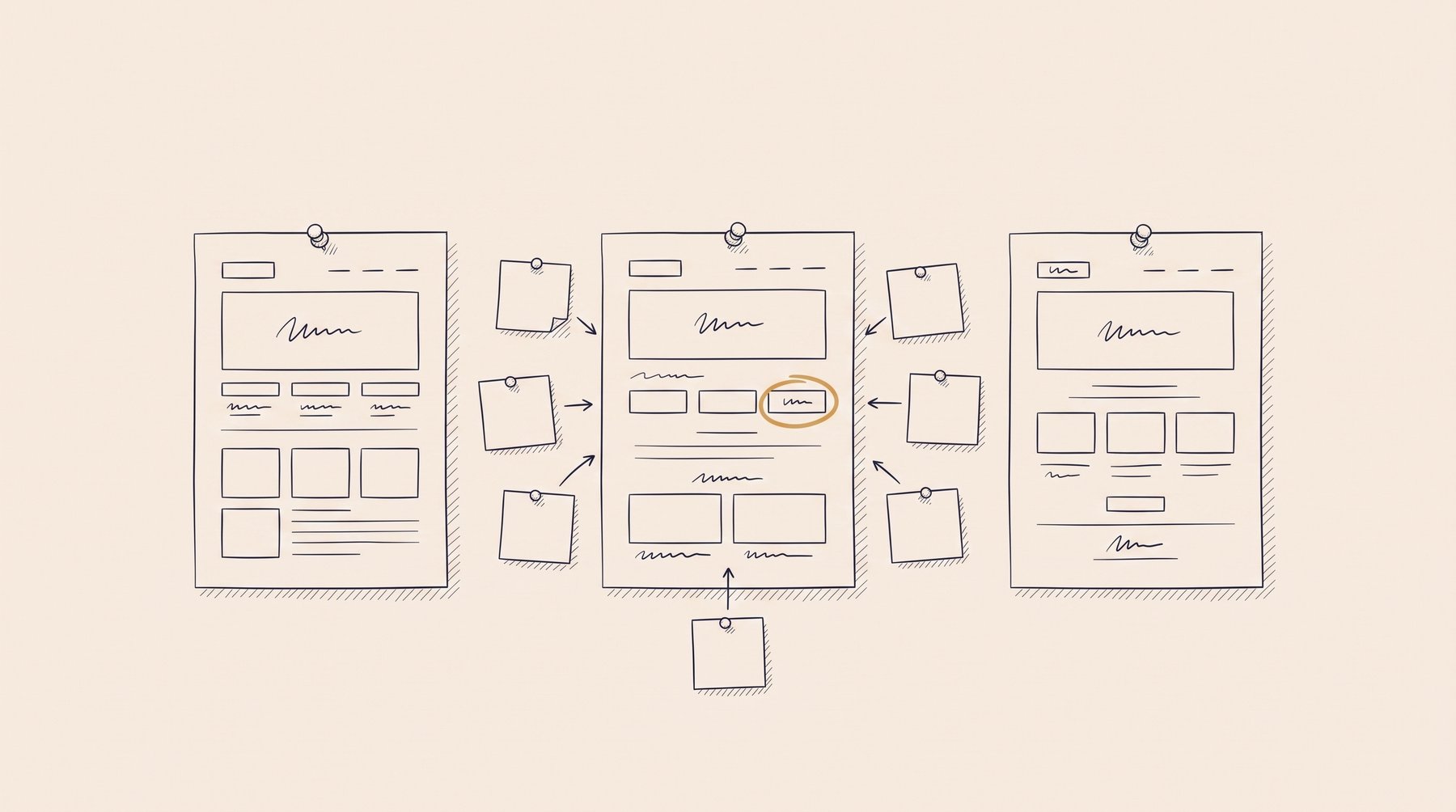
The critique where your screen goes on the wall
Design critiqueVisual hierarchyAffordance
Deck: Product & UX
The call an hour before the release
Go/no-goFeature flagStaged rollout
Deck: Product & UX

Watching five people use the thing you built
Usability testingScreenerThink-aloud protocol
Deck: Product & UX
In the app, these cards come as the day’s set — already made.